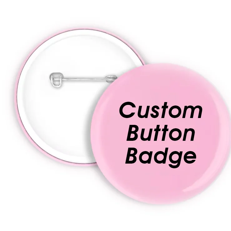
Creating compelling button badges that authentically represent your brand personality requires a strategic approach that balances visual appeal with meaningful design elements. Whether you're launching a new marketing campaign, promoting corporate events, or building brand awareness, a well-designed custom button badge serves as a powerful marketing tool that extends your brand's reach while creating memorable touchpoints with your target audience.

The design process begins with understanding your brand's core values, visual identity, and communication objectives. Successful badge designs seamlessly integrate your existing brand elements while adapting them to work effectively within the circular constraints of button badges. This article explores comprehensive strategies for creating button badges that not only look professional but also communicate your brand's unique personality and values to your audience.
Modern businesses increasingly recognize button badges as versatile marketing assets that offer exceptional return on investment. From trade shows and corporate events to employee recognition programs and promotional campaigns, these compact marketing tools provide tangible ways for customers and stakeholders to connect with your brand long after initial interactions.
Understanding Your Brand Identity Foundation
Defining Core Brand Values
Before beginning any design work, establish a clear understanding of your brand's fundamental values and personality traits. Consider whether your brand embodies innovation, reliability, creativity, or professionalism. These characteristics should directly influence your design choices, from color palettes and typography to imagery and messaging approaches.
Document your brand's mission statement, target audience demographics, and competitive positioning. This foundation ensures that your button badge design aligns with broader marketing strategies while maintaining consistency across all brand touchpoints. Strong brand foundations result in more cohesive and impactful design outcomes.
Analyze successful brands within your industry to identify common visual patterns and differentiation opportunities. Understanding competitive landscapes helps create designs that stand out while remaining appropriate for your market sector and audience expectations.
Analyzing Visual Brand Elements
Examine your existing brand assets including logos, color schemes, typography, and imagery styles. Identify which elements translate effectively to small-format designs and which require modification for optimal badge presentation. Consider how your logo performs at various sizes and whether simplified versions might be necessary.
Evaluate your brand's color psychology and emotional associations. Colors evoke specific responses and should reinforce your intended brand personality. Professional service brands might emphasize blues and grays for trustworthiness, while creative agencies could leverage vibrant colors to demonstrate innovation and energy.
Typography choices significantly impact brand perception and readability at small sizes. Assess your current fonts for badge compatibility and consider whether custom lettering or simplified text treatments would better serve your design objectives.
Strategic Design Planning Process
Setting Clear Design Objectives
Establish specific goals for your custom button badge project, whether increasing brand awareness, promoting specific products, or supporting event marketing initiatives. Clear objectives guide design decisions and help measure campaign effectiveness after implementation.
Consider your target audience's preferences, age demographics, and cultural backgrounds. Design elements that resonate with millennials might differ significantly from those appealing to corporate executives or industry professionals. Tailor your approach accordingly while maintaining brand authenticity.
Define success metrics for your badge campaign, including distribution goals, engagement rates, and brand recognition improvements. Quantifiable objectives enable better design evaluation and future campaign optimization.
Research and Inspiration Gathering
Conduct comprehensive research into current design trends, industry standards, and innovative approaches within your market sector. Study successful badge campaigns from both direct competitors and brands in adjacent industries to identify effective strategies and creative opportunities.
Explore various design styles including minimalist, vintage, modern, and artistic approaches. Consider how different styles might communicate different aspects of your brand personality while remaining appropriate for your audience and industry context.
Document inspiration sources and create mood boards that capture your desired aesthetic direction. Visual references help maintain design consistency throughout the creative process and facilitate better communication with designers or production partners.
Color Psychology and Brand Communication
Strategic Color Selection
Colors serve as primary communication tools that instantly convey brand personality and emotional messages. Red suggests energy and urgency, blue communicates trust and reliability, while green often represents growth and sustainability. Choose colors that align with your brand values and target audience expectations.
Consider color combinations and contrast ratios to ensure optimal readability and visual impact. High contrast between text and background colors improves legibility, while complementary color schemes create visually appealing designs that attract attention without overwhelming viewers.
Account for production constraints and color reproduction accuracy across different manufacturing processes. Some colors reproduce more reliably than others, and understanding these limitations helps avoid disappointment with final products.
Cultural and Industry Considerations
Research color associations within your target markets and industry sectors. Colors carry different meanings across cultures, and what appears professional in one context might seem inappropriate in another. International brands particularly benefit from thorough cultural research before finalizing color schemes.
Analyze competitor color usage to identify differentiation opportunities while remaining appropriate for your industry. Unique color combinations help brands stand out while maintaining professional credibility and market relevance.
Consider seasonal variations and campaign timing when selecting colors. Holiday campaigns might incorporate seasonal colors, while year-round promotional materials require more neutral, timeless color approaches that maintain relevance across different periods.
Typography and Message Integration
Font Selection Strategies
Typography choices significantly impact brand personality communication and message readability. Sans-serif fonts typically convey modernity and cleanliness, while serif fonts suggest tradition and reliability. Script fonts can add personality but require careful application to maintain professionalism.
Test font legibility at actual badge sizes before finalizing typography choices. Many fonts that appear clear on screen become illegible when printed at small dimensions. Consider letter spacing, weight, and size relationships to optimize readability across various viewing distances.
Maintain consistency with your existing brand typography while adapting for badge-specific requirements. Custom lettering or simplified versions of brand fonts might be necessary to achieve optimal results within circular design constraints.
Message Hierarchy and Content Strategy
Develop clear message hierarchies that prioritize essential information while supporting secondary elements. Primary messages might include brand names or key slogans, while secondary information could feature contact details or campaign-specific messaging.
Consider message length and complexity relative to badge size limitations. Concise, memorable messages perform better than lengthy text blocks that become difficult to read. Focus on core value propositions or memorable brand phrases that reinforce key positioning.
Balance text elements with visual components to create harmonious compositions that communicate effectively without appearing cluttered or overwhelming. White space plays crucial roles in design clarity and overall professional appearance.
Visual Elements and Logo Adaptation
Logo Optimization Techniques
Adapt your existing logo for optimal badge performance through simplification and scaling considerations. Complex logos often require simplified versions that maintain brand recognition while improving clarity at small sizes. Remove fine details and intricate elements that might not reproduce clearly.
Consider logo placement within circular boundaries and how different orientations might affect visual impact. Centered placements work well for symmetrical logos, while asymmetrical designs might require strategic positioning to achieve balanced compositions.
Test logo variations across different backgrounds and color combinations to ensure versatility and consistent brand recognition. Develop both positive and reverse versions to accommodate various design scenarios and production requirements.
Supporting Graphic Elements
Incorporate supporting visual elements that enhance brand personality without competing with primary logo placement. Decorative borders, background patterns, or subtle textures can add visual interest while maintaining professional appearance and brand consistency.
Consider iconography that reinforces brand values or industry associations. Technology companies might incorporate circuit patterns, while environmental brands could use nature-inspired elements. Ensure supporting graphics complement rather than overwhelm primary brand elements.
Maintain visual balance through strategic element placement and sizing relationships. Supporting graphics should enhance overall design composition while allowing primary brand elements to maintain prominence and readability.
Production Considerations and Technical Requirements
Material Selection and Quality Factors
Choose appropriate materials and production methods based on intended use, budget constraints, and quality expectations. Metal badges offer premium appearance and durability, while plastic alternatives provide cost-effective solutions for large-quantity distributions or temporary campaigns.
Consider finish options including matte, gloss, or specialty treatments that enhance design presentation and align with brand aesthetics. Premium finishes can elevate perceived value and reinforce quality brand positioning, while standard finishes remain appropriate for high-volume promotional applications.
Evaluate durability requirements based on expected usage patterns and distribution environments. Badges worn frequently or exposed to harsh conditions require more robust materials and construction methods than those used for single events or indoor applications.
Size and Specification Planning
Determine optimal badge dimensions based on design complexity, text requirements, and intended applications. Larger sizes accommodate more detailed designs but increase production costs, while smaller badges offer cost advantages but require simplified approaches.
Account for production tolerances and minimum feature sizes when finalizing design specifications. Text smaller than specific thresholds might not reproduce clearly, and fine lines or details could disappear during manufacturing processes.
Consider attachment methods and their impact on design presentation. Pin backs, magnetic attachments, or adhesive options each influence badge thickness and overall appearance, potentially affecting design layout and material choices.
Testing and Refinement Strategies
Prototype Development Process
Create physical prototypes to evaluate design effectiveness in real-world conditions before committing to large production runs. Prototypes reveal issues that might not be apparent in digital mockups, including color accuracy, readability, and overall visual impact.
Test prototypes with target audience representatives to gather feedback on design appeal, brand recognition, and message comprehension. Objective feedback helps identify improvement opportunities and validates design decisions before final production.
Evaluate prototypes under various lighting conditions and viewing distances to ensure consistent performance across different environments. Badges viewed under fluorescent office lighting might appear different than those seen under natural daylight or LED illumination.
Iteration and Optimization
Refine designs based on prototype testing results and stakeholder feedback. Make incremental adjustments to color balance, typography, sizing, or layout elements to improve overall effectiveness and brand alignment.
Document design iterations and decision rationales to maintain consistency across future projects and enable efficient modification processes. Comprehensive documentation supports brand consistency and streamlines production workflows.
Consider developing multiple design variations for different applications or audience segments. Varied approaches within consistent brand guidelines allow for targeted messaging while maintaining overall campaign cohesion.
Implementation and Distribution Planning
Campaign Integration Strategies
Integrate button badge distribution into broader marketing campaigns to maximize impact and create cohesive brand experiences. Coordinate badge designs with other promotional materials, digital campaigns, and event marketing efforts for reinforced messaging.
Plan distribution strategies that reach target audiences effectively while supporting campaign objectives. Trade show distributions require different approaches than employee recognition programs or customer appreciation initiatives.
Consider packaging and presentation methods that enhance perceived value and create memorable unboxing experiences. Professional packaging reinforces brand quality perceptions and increases recipient likelihood of badge usage and retention.
Performance Measurement
Establish metrics for evaluating badge campaign success including distribution numbers, recipient engagement, and brand awareness improvements. Quantifiable measurements enable objective assessment and inform future campaign optimization strategies.
Monitor social media mentions and user-generated content featuring your badges to gauge organic engagement and brand advocacy. Positive social sharing indicates successful design resonance with target audiences.
Collect recipient feedback through surveys or informal interviews to understand badge effectiveness and identify areas for future improvement. Direct feedback provides valuable insights for subsequent design iterations and campaign planning.
FAQ
What size should my custom button badge design be for optimal readability
The optimal size for custom button badges typically ranges from 1.25 to 2.25 inches in diameter, with 1.75 inches being the most popular choice for promotional purposes. This size provides sufficient space for logos and text while remaining comfortable to wear and cost-effective to produce. Smaller badges work well for simple logos or single words, while larger sizes accommodate more complex designs with multiple text elements. Consider your design complexity and intended usage when selecting dimensions, as badges worn on clothing should not be so large as to appear overwhelming or unprofessional.
How do I ensure my brand colors reproduce accurately on button badges
Accurate color reproduction requires providing your manufacturer with specific color codes, preferably Pantone references, rather than relying on RGB or CMYK approximations. Request color proofs or samples before full production to verify color accuracy and make adjustments if necessary. Some colors reproduce more reliably than others in badge manufacturing, so discuss any challenging colors with your production partner early in the process. Consider that metallic or fluorescent colors may require special processes and could affect pricing and minimum order quantities.
What design elements should I avoid when creating button badges
Avoid using fonts smaller than 8 points, as they may become illegible at badge size. Extremely thin lines or fine details often disappear during production, so simplify complex graphics for better reproduction. Don't place important text or design elements too close to the badge edges, as cutting tolerances could affect the final appearance. Avoid using too many colors in gradient designs, as they may not reproduce smoothly in printing processes. Steer clear of copyrighted images or fonts unless you have proper licensing, and avoid designs that could be considered offensive or inappropriate for your target audience.
How can I make my button badge design stand out at trade shows and events
Create eye-catching designs using bold colors and high contrast combinations that remain visible from a distance. Incorporate unique shapes within the circular format, interesting typography treatments, or memorable slogans that spark conversation. Consider special finishes like holographic effects, glow-in-the-dark elements, or textured surfaces that create tactile interest. Design badges that complement your booth aesthetics while remaining distinctive enough to be remembered after the event. Include clear brand identification so recipients can easily connect with your company later, and consider creating limited edition designs that add exclusivity value to your promotional items.
Table of Contents
- Understanding Your Brand Identity Foundation
- Strategic Design Planning Process
- Color Psychology and Brand Communication
- Typography and Message Integration
- Visual Elements and Logo Adaptation
- Production Considerations and Technical Requirements
- Testing and Refinement Strategies
- Implementation and Distribution Planning
- FAQ

